
During the recent past a new branch of biology – the quantitative biology – established. In this context we and others generate high qualitity quantitative protein data sets counting the number of protein molecules in an average cell. This data is provided to the systems biology and modelling community and need sufficient visualization tools for an adquate presentation.
Often it is interesting to know, how many ressources a biological system invests to produce a defined protein such as GroEL under heat shock conditions or to synthesize Enolase to enable a balanced flux of glucose through the glycolytic pathway. Classical data visualization tools such as pie charts or bar charts are limited to small sets of data. They cannot handle our data sets in a sufficient way. By this reason we established abundance treemaps that encode the celular investment for a certain protein or a protein set necessary to provide a cellular function as area sizes.
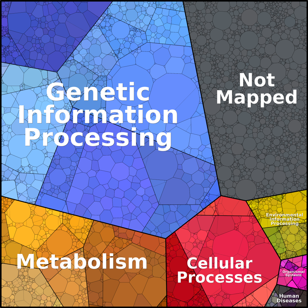
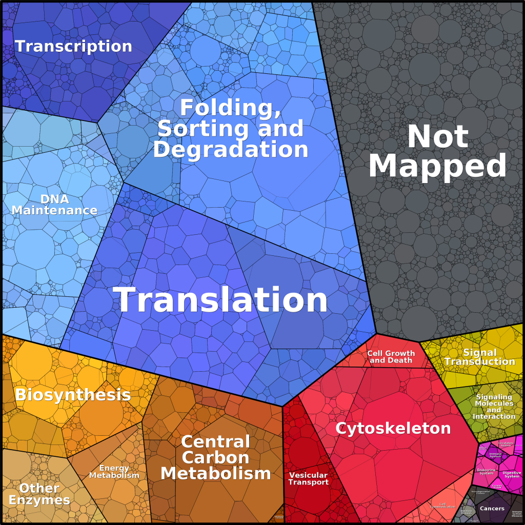
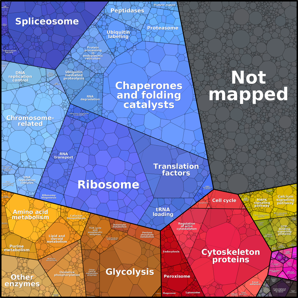
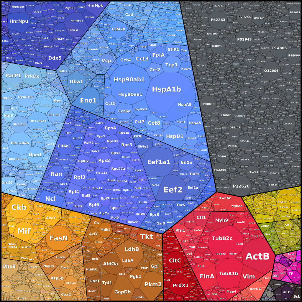
This Voronoi Treemap encodes a KEGG related gene funcitonal classification scheme as colors and the cellular investment of HEK cells as area sizes. Abundance treemaps have been presented by our group at the VizBi2014 conference. A more complete data set is presented at www.proteomaps.net and was published in collaboration with Ron Milo and coworkers from the Weizmann Institute of Science in Israel 2014 in PNAS.
In meta-omics studies abundance treemaps can be used to visualize the compostion of complex communites. Here the abundance of different taxa embedded in the phylogenetic tree can be presented. This was exemplary shown in our review on data visualization in envrionmental proteomics 2013 in Proteomics.